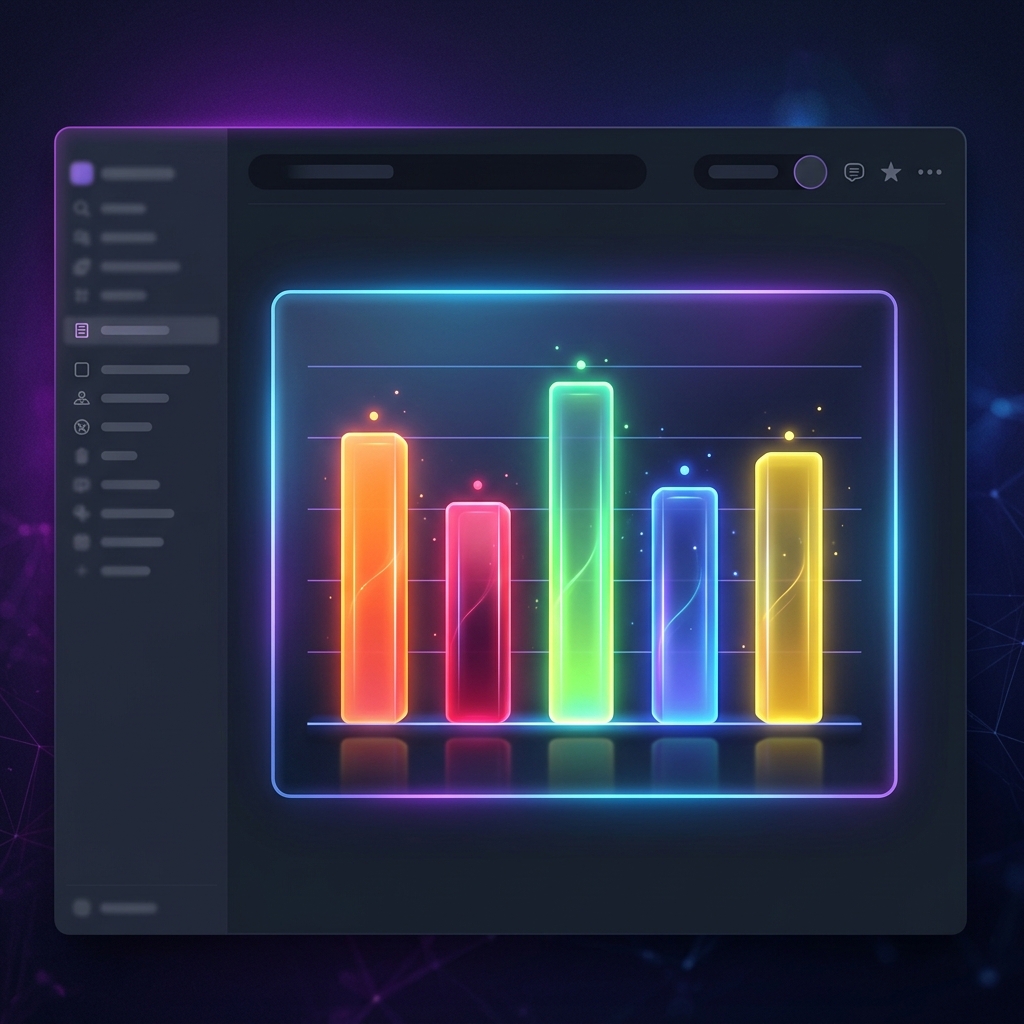
When it comes to comparing quantities across different categories—like monthly sales, team tasks, marketing campaigns, or personal finance tracking—there is no better visual aid than a bar chart or column chart.
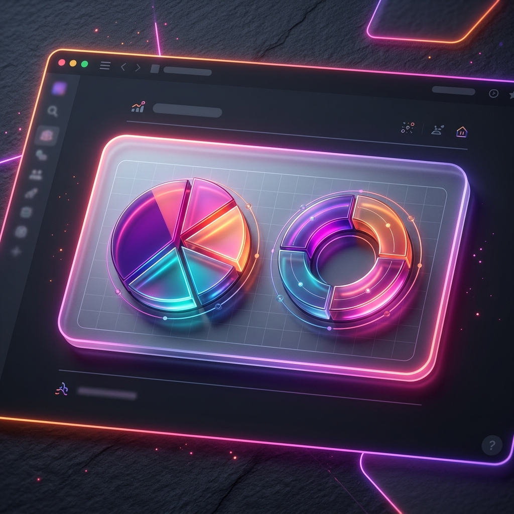
While Notion is an exceptional tool for organizing databases, its built-in data visualization options are basic and highly restrictive. For anyone trying to build a premium, professional-grade executive dashboard or public-facing documentation, tables and lists just aren't engaging enough.
In this step-by-step tutorial, we will show you how to create stunning, interactive, and auto-updating bar charts for Notion using Vizelify Charts—and embed them directly into your workspace.
Why Use Bar Charts in Notion?
A bar chart uses horizontal or vertical bars to compare values across different categories. One axis displays the specific categories being compared, while the other axis represents a discrete value scale.
Bar charts are extremely effective for:
- Project Management: Compare the number of tasks assigned or completed per team member.
- Sales & Revenue Tracking: View monthly or quarterly performance side-by-side.
- Budgeting: Visualize expenditures across different departments or categories.
- Inventory Control: Monitor stock levels for different products or SKU categories.
Step 1: Format Your Notion Database
For the cleanest visualization, structure your Notion database so that each row represents a category, and at least one column contains the numeric data you want to measure.
For example, a "Marketing Campaign Performance" database might look like this:
| Campaign Name | Platform | Leads Generated | Spend (USD) | | :--- | :--- | :--- | :--- | | Spring Launch | Facebook | 450 | 1200 | | Newsletter Promo | Email | 180 | 150 | | Summer Sale | Google Ads | 620 | 2500 | | Influencer Push | Instagram | 310 | 900 |
Here, the Campaign Name represents our category labels, and Leads Generated or Spend represents our values.
Step 2: Connect Your Notion Workspace to Vizelify Charts
- Sign up or log into your Vizelify Charts account.
- Go to your dashboard and click Connect Notion Workspace.
- Choose the specific pages or databases you want to grant access to (select the database we formatted in Step 1).
- Click Authorize.
Your Notion data is now securely connected and ready for instant charting!
Step 3: Configure and Style Your Bar Chart
Once your database is loaded in Vizelify Charts:
- Click Create New Chart and select your connected Notion database.
- Select Bar Chart or Stacked Bar Chart from the left panel.
- Map your fields: Set your X-Axis to the category column (e.g.,
Campaign Name) and your Y-Axis to the numeric metric (e.g.,Leads Generated). - Customize the Design:
- Vibrant Color Palettes: Select high-contrast, premium color schemes.
- Rounded Corners: Add smooth border radius settings to your bars for a modern, sleek aesthetic.
- Grid Lines & Labels: Adjust label visibility and grid spacing to keep the chart clean.
- Dark Mode: Toggle dark theme options if your Notion workspace uses a dark aesthetic.
Step 4: Embed Directly in Notion
Now that your bar chart is ready:
- Click Share & Embed in the top right corner of the Vizelify Charts builder.
- Copy the generated Live URL to your clipboard.
- Navigate to your Notion page where you want the chart to live.
- Type
/embedand hit enter. - Paste the URL into the field and click Embed Link.
- Resize the embed block to fit your dashboard layout perfectly!
[!TIP] Auto-Updating Data: The best part about using Vizelify Charts is that your embedded chart remains fully connected. When you edit numbers, add rows, or delete records in your Notion database, your bar chart will automatically update in real-time. No manual exports or rebuilding required.
Elevate Your Dashboards Today
Standard tables can lead to information overload. By transforming your raw data into stunning, interactive bar charts, you make your Notion pages instantly understandable and premium.
Whether you're presenting to stakeholders, tracking personal growth, or coordinating with team members, Vizelify Charts gives you the professional visual edge that native Notion lacks.