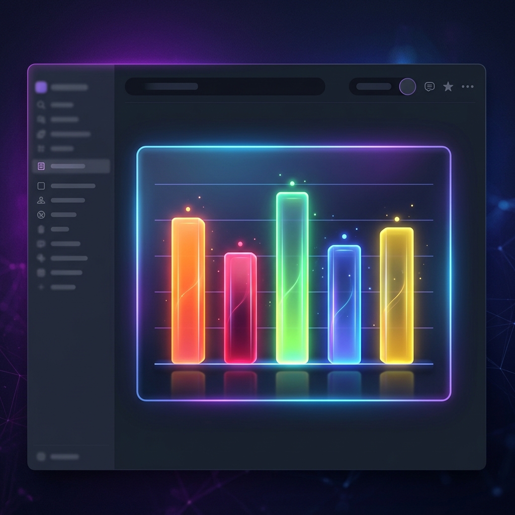
When it comes to visualizing proportional relationships—such as budget allocations, market share, demographic breakdowns, or task status distributions—nothing is quite as intuitive as a pie chart or a modern donut chart.
In business reports, slide decks, and project boards, showing how sections of a category compare to the whole in a clean circular design is incredibly powerful. However, native Notion layouts do not support circular visualizations, leaving you stuck with large tables or boring numbers.
In this guide, we will walk you through how to construct, style, and embed fully interactive pie and donut charts for Notion databases using Vizelify Charts in under a minute.
When to Use Pie vs. Donut Charts
While they are very similar, subtle design differences can change how your data is perceived:
- Pie Charts: Best for displaying simple proportions (usually 2 to 6 slices). They emphasize the comparative size of each segment as a fraction of the whole.
- Donut Charts: Provide a more modern aesthetic by carving out the center. The empty space is excellent for displaying a total sum, average, or an icon, reducing clutter while preserving visual accuracy.
Step 1: Prep Your Notion Database
A pie or donut chart requires categorical names (slices) and numerical metrics (slice sizes). To keep the chart clean, make sure to group your data so you have fewer than 7-8 slices. Too many slices make circular charts extremely hard to read.
For example, a "Monthly Personal/Business Budget" database might look like this:
| Expense Category | Allocation (USD) | Spent to Date (USD) | | :--- | :--- | :--- | | Operations & SaaS | 1200 | 1150 | | Marketing & Ads | 800 | 720 | | Salaries & Contractors | 3000 | 3000 | | Office Rent & Utilities | 750 | 750 | | Legal & Accounting | 300 | 250 |
Step 2: Authorize Your Database with Vizelify Charts
- Log into your Vizelify Charts account.
- Navigate to the Data Sources tab and click Connect Notion.
- Choose the page containing your budget or metrics database.
- Click Allow Access to sync your workspace securely.
Step 3: Generate a Premium Pie or Donut Widget
- Click New Chart on the dashboard and select your synced Notion database.
- Select Pie Chart or Donut Chart from the chart layout options.
- Map the fields:
- Label Field: Set to the category name (e.g.,
Expense Category). - Value Field: Set to the numeric value (e.g.,
Allocation (USD)).
- Label Field: Set to the category name (e.g.,
- Elevate the Visual Styling:
- Aesthetics & Colors: Pick matching premium pastel or vibrant neon color schemes to make your dashboard stand out.
- Center Label (Donut Only): Add a custom center text like "Total Budget: $6,050" directly inside the donut hole.
- Interactive Tooltips: Ensure users can hover over slices to see the exact percentage and dollar amount.
- Legends: Choose between top, bottom, left, or right legend alignments to complement your Notion page width.
Step 4: Embed Your Interactive Widget into Notion
Once you are completely satisfied with the look:
- Click the Share & Embed button in the Vizelify Charts header.
- Click Copy Link to save the live, secure embed URL.
- Open your Notion workspace and find the page you want to enrich.
- Paste the link directly on an empty line, then select Create Embed from the popup.
- Scale and align the block as desired.
The Benefits of Vizelify Charts
Creating visual proportions shouldn't require copy-pasting numbers into spreadsheet tools every week.
- 100% Automatic Updates: When you edit your numbers or categories in Notion, your chart updates immediately.
- Responsive Layouts: Our embed blocks resize beautifully on mobile devices, tablets, and full desktop screens.
- Professional Styling: Avoid standard browser default aesthetics with custom border styles, elegant glow effects, and modern fonts.
Transform your static workspaces into high-fidelity dashboards that impress.